Color is one of the most powerful tools in interior design, influencing mood, perception, and the overall atmosphere of a space. Understanding color theory can help homeowners and designers create harmonious environments that reflect personal style while promoting well-being. This article delves into the essentials of color theory, exploring how to choose and combine colors effectively in interior design.
The Basics of Color Theory
Color theory encompasses a set of guidelines used to understand how colors interact, how they can be combined, and the emotions they evoke. At its core, color theory is based on the color wheel, which categorizes colors into three primary types: primary, secondary, and tertiary colors. Primary colors—red, blue, and yellow—are the foundation of the color wheel. By mixing primary colors, secondary colors (green, orange, and purple) are created, and further mixing leads to tertiary colors, which are combinations of primary and secondary hues.
Understanding the relationships between these colors is crucial when designing a space. Complementary colors are opposite each other on the color wheel, creating high contrast and vibrant effects when used together. Analogous colors, which are next to each other on the wheel, create a harmonious and cohesive look, ideal for creating a calming atmosphere. Triadic colors, which form a triangle on the wheel, offer a balanced yet dynamic approach, making them perfect for adding interest without overwhelming the space.
Choosing a Color Palette
Selecting a color palette is one of the most critical steps in interior design. Start by identifying the mood you want to convey in the space. Warm colors such as reds, oranges, and yellows evoke feelings of warmth and energy, making them suitable for social spaces like living rooms and dining areas. Cool colors like blues, greens, and purples promote calmness and tranquility, making them ideal for bedrooms and relaxation areas.
When choosing a palette, consider starting with a base color that will dominate the space. From there, select accent colors that complement the base and enhance the overall theme. A common approach is the 60-30-10 rule, where 60% of the room is covered in the dominant color, 30% in a secondary color, and 10% in an accent color. This balance helps create visual interest while maintaining harmony throughout the room.
The Power of Neutrals
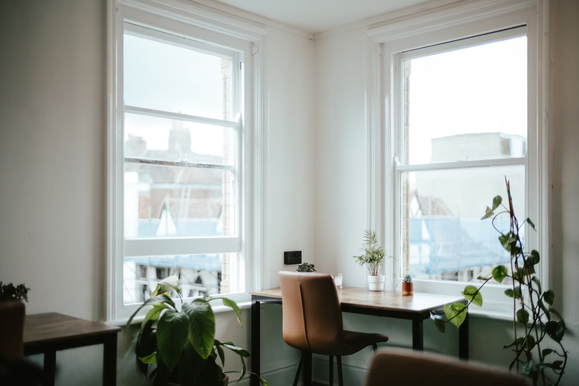
While vibrant colors can energize a space, neutrals play a vital role in grounding a design. Shades like whites, grays, beiges, and browns provide a versatile backdrop that allows other colors to shine. Neutrals can make spaces feel more spacious and cohesive, particularly when paired with bold accent colors. Consider using a neutral color as the foundation for walls or larger furniture pieces, then add pops of color through accessories, artwork, and textiles.
In addition to serving as a backdrop, neutrals can also introduce warmth and texture. Textured neutral elements, such as a woven rug or a linen sofa, add depth to a room without overpowering other design elements. This approach allows for flexibility in updating the space as styles and preferences change over time.
Creating Contrast and Depth
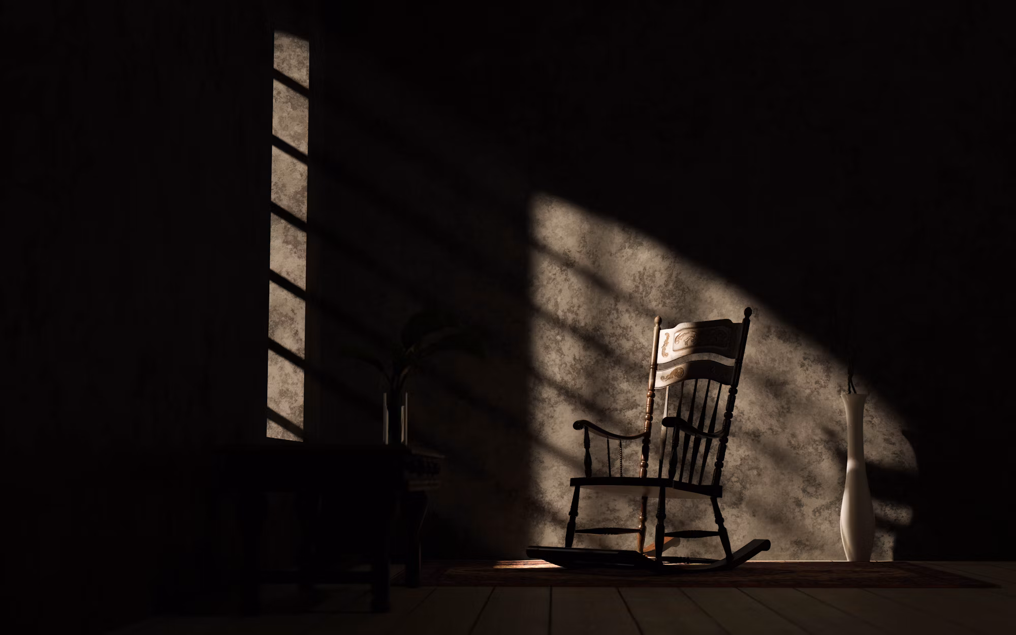
Contrast is an essential element of effective color use in interior design. It helps to define different areas within a space, guiding the eye and creating focal points. High contrast, such as pairing dark colors with light ones, can add drama and visual interest. For example, a navy blue wall paired with crisp white trim creates a striking effect that draws attention.
Depth can also be achieved by layering colors and textures. For instance, using varying shades of a single color can create a sophisticated monochromatic look while adding dimension. Incorporating different materials, such as glossy finishes alongside matte surfaces, enhances this effect, providing visual variety and richness.
Incorporating Patterns
Patterns can introduce additional complexity and interest to a color scheme. When incorporating patterns, consider how they interact with your chosen colors. A bold patterned rug can serve as a focal point, while more subtle patterns can add texture without overwhelming the design. Mixing patterns is an art that requires careful consideration of scale, color, and style.
A successful way to combine patterns is to choose one dominant pattern and support it with smaller, complementary patterns. For example, a large floral print can be paired with smaller geometric patterns, ensuring that the overall look remains cohesive. The key is to maintain a balance that feels intentional and harmonious, allowing each pattern to enhance the others.
The Psychology of Color
Colors can significantly influence mood and behavior, making the psychology of color an essential aspect of interior design. Understanding how different colors affect emotions can guide decisions in creating spaces that align with desired feelings and activities. For example, blue is often associated with calmness and tranquility, making it ideal for bedrooms or meditation areas. On the other hand, yellow can inspire energy and creativity, making it a great choice for home offices or playrooms.
When designing spaces, consider the intended use and how color can support the desired atmosphere. For example, in a kitchen, warm colors like yellow and orange can stimulate appetite and conversation, while cooler tones can create a more serene dining experience. By leveraging color psychology, designers can curate environments that enhance daily life.
Testing Colors in Your Space
Before committing to a color scheme, it’s essential to test colors in the actual space. Colors can appear differently under various lighting conditions, so always sample paint or fabric swatches in the intended area. Observe how natural light interacts with colors at different times of the day, and consider the impact of artificial lighting as well. This step ensures that the chosen colors will work harmoniously within the space and achieve the desired effect.
Conclusion
Mastering color theory is a powerful tool for creating harmonious and inviting interiors. By understanding the basics of color relationships, choosing a cohesive palette, and incorporating patterns and textures, homeowners can transform their spaces into beautiful reflections of their style. The impact of color on mood and perception cannot be underestimated, making thoughtful color choices essential in interior design. Ultimately, the goal is to create environments that not only look stunning but also feel comfortable and uplifting, enhancing the quality of life within the home.